

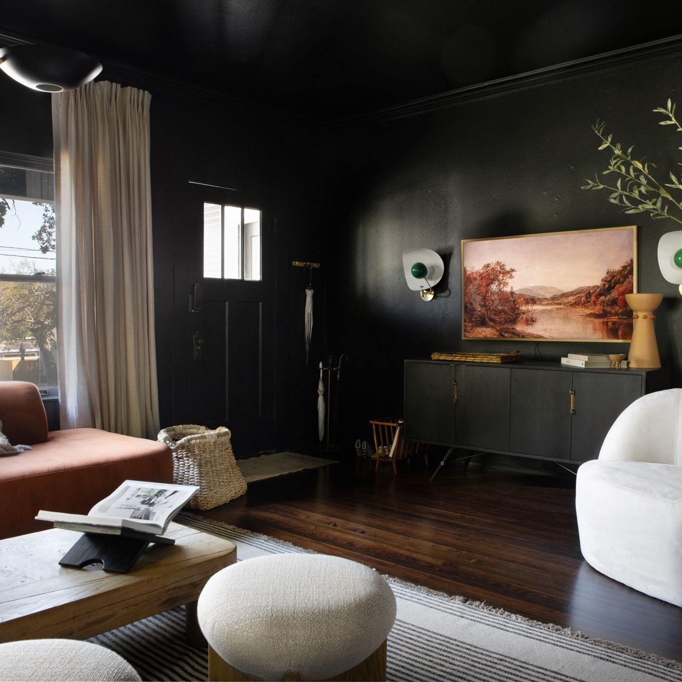
Walk through almost any real estate staging showcase, starter apartment, or safe renovation project, and you will encounter the same advice repeated like an unassailable truth: if a room is small, you must paint it white. The logic, handed down through decades of timid decorating manuals, sounds reasonable enough on paper. Light colors reflect illumination; light creates the illusion of expansiveness; therefore, white walls will make an eighty-square-foot powder room or a cramped study feel like an airy loft.
There is only one problem with this rule: it fundamentally misunderstands how light, shadow, and human perception operate in three dimensions.
When you coat a small, enclosed room that lacks generous natural exposure in brilliant white or pale greige, the result is rarely expansive. Instead of feeling airy, the space almost always looks flat, chalky, and sterile. White paint does not generate light out of thin air; it merely reflects whatever illumination already exists. In a tight footprint with a single north-facing window or no exterior glass at all, pale paint turns an unappealing, dishwater gray in the shadows.
It is time to discard the conventional wisdom. Drenching a small room in deep charcoal, moody navy, forest green, or rich espresso does not shrink your living space. Handled with intention, dark paint does the exact opposite: it dissolves physical boundaries, creates remarkable visual depth, and transforms an awkward space into an unforgettable design statement.
The Flaw in the White Paint Fallacy
To understand why dark colors succeed so brilliantly in small quarters, you must first recognize why pale neutrals so frequently fail. Natural light is dynamic. In a spacious living room with ten-foot ceilings and expansive south-facing windows, white paint works because sunlight sweeps across the surfaces throughout the day, catching architectural millwork and bouncing warmth back into the volume.
In a compact footprint—a narrow foyer, an interior bathroom, or a modest home office—that dynamic wash of natural daylight simply does not exist. Without direct sun, pale pigments fall completely flat. Instead of appearing crisp and clean, the room gathers murky shadows in every corner. The flat, light surfaces reflect those shadows back across one another, giving the space an institutional cast.
More critically, a pale color scheme draws an unmistakable outline around the room’s modest proportions. The eye immediately clocks every ceiling line, every baseboard joint, and every corner seam. You can pinpoint exactly where the walls begin, where they terminate, and where the room runs out of room. Trying to force a compact, low-light footprint to impersonate a breezy gallery is an uphill battle against architectural reality. By shifting toward saturated, moody pigments, you stop fighting the room’s inherent dimensions and start capitalizing on them.
The Physics of Edge Dissolution
The primary reason dark paint works so effectively in small rooms comes down to spatial perception and edge definition. Human vision gauges the size of an interior volume by mapping its architectural seams—the sharp intersections where walls meet other walls, floors, and ceilings. When a room is painted off-white or beige, the contrast between the illuminated wall plane and the shadowed corner crease is sharp and immediate. Your brain instantly registers the room’s physical limits, creating a rigid mental map of the container.
Dark pigments manipulate this perceptual mechanism through light absorption. Deep colors like midnight navy, slate, espresso, and blackened olive absorb ambient shadows rather than showcasing them.
How Corners Disappear
When natural and artificial shadows fall into the corner of a dark room, the crevice does not produce a harsh contrast line. Because the corner is already bathed in a deep, light-absorbing pigment, the physical seam visually blurs. The eye travels across the intersection without snagging on sharp perimeter markers. Interior architects refer to this phenomenon as edge dissolution.
When the brain cannot quickly pinpoint where one wall ends and another begins, it struggles to define the exact dimensions of the container. The physical perimeter recedes into an atmospheric blur. Much like staring out across open water at dusk or looking into a clear night sky, the visual field suggests depth and continuum rather than confinement. The walls step backward, leaving behind an illusion of immersive space.
Embracing the Jewel Box Effect
There is an emotional dimension to interior architecture that floor plan dimensions fail to capture. Scale is entirely relative, and designing every room in a house to feel cavernous misses the value of contrasting spatial rhythms. A well-designed home benefits from dynamic pacing—moments of openness and light balanced by intimate rooms of shelter and warmth.
Small rooms possess an innate sense of enclosure. When you lean into that scale by wrapping the room in saturated color, you create a classic jewel box.
Instead of an apology for limited square footage, the space becomes a sensory destination. Powder rooms are the ultimate proving ground for this approach. Because guests spend only brief periods inside a powder room, the space does not demand the calm, functional neutrality of an everyday kitchen. It invites drama. A small bath wrapped in deep aubergine, glossy black, or rich botanical green feels deliberate, luxurious, and distinctly transportive.
The same logic applies to home dens, library nooks, and bedrooms. In these spaces, sprawling expanses of white paint feel exposed rather than peaceful. An enveloping, dark perimeter fosters genuine psychological comfort, reducing sensory noise and signaling a space meant for retreat.
Color Drenching: Eliminating Visual Interruption
A frequent mistake when experimenting with dark paint is losing momentum halfway through the execution. Homeowners will paint the four walls an evocative hunter green, but leave the baseboards, window casings, door frames, and ceiling in standard builder white.
This high-contrast framing shatters the spatial magic of dark walls. Crisp white trim acts like a bold outline around every single wall surface, calling immediate attention to the exact perimeter you are trying to soften. It chops the room into segmented panels, accentuating low ceiling heights and highlighting narrow spans.
The antidote to this visual clutter is color drenching.
Color drenching involves painting every architectural element in the room within the same color family, if not the exact same paint code. The walls, baseboards, doors, window trim, crown molding, and even the ceiling share the identical moody shade.
By eliminating the stark contrast of white trim, you remove the horizontal lines that break up wall height. Your eye glides from the floor straight up through the crown molding to the ceiling plane without interruption. This unbroken vertical sweep makes standard eight-foot ceilings feel significantly taller. Furthermore, awkward architectural quirks—such as uneven HVAC soffits, off-center doors, or irregular closet returns—simply blend into the background rather than demanding attention.
Mastering Finish and Sheen
Color selection is only half the battle; sheen determines how that pigment interacts with the room’s light sources. Selecting the wrong finish can turn an ambitious dark color choice either muddy or excessively harsh. In tight quarters, two deliberate finish strategies yield the most sophisticated results.
Velvet and Ultra-Matte Walls
For bedrooms, media rooms, and living spaces, an ultra-matte or chalky finish offers exceptional depth. High-quality flat and matte paints absorb direct and ambient light completely, lending the wall an almost tactile, suede-like softness.
A matte finish is also remarkably forgiving on older drywall, uneven plaster, and minor surface imperfections that higher sheens accentuate. Because matte surfaces scatter light rather than bouncing it back in sharp glares, they allow corners and shadows to dissolve with maximum subtlety, reinforcing the cocoon-like atmosphere of the room.
High Gloss and Lacquer Treatments
On the opposite end of the finish spectrum sits high-gloss paint and traditional lacquer. While unconventional in larger living areas, high-gloss finishes deliver incredible results in small entryways, wet bars, and powder rooms.
A high-gloss dark finish turns the wall or ceiling into an active mirror. Instead of absorbing light, the surface catches reflections from lamps, mirrors, and doorways, creating a liquid-like secondary dimension. When applied to a ceiling, high-gloss dark paint reflects the room below, visually doubling the apparent ceiling height and making the room feel open rather than confined.
Layered Lighting: The Key to Moody Environments
A dark palette will fall completely flat if the lighting plan is treated as an afterthought. The goal of painting a small room dark is never to build a dim, murky cave; the goal is to cultivate a warm, nuanced glow.
The quickest way to ruin a dark room is to rely on a single, powerful ceiling fixture—the ubiquitous overhead flush-mount. Flooding a dark space from a single high-intensity overhead source creates severe downward shadows, flattens the rich undertones of the paint, and highlights every wall flaw. Instead, the space requires deliberate, low-level illumination layered throughout the layout.
Spread Low-Level Fixtures Across the Room
Incorporate multiple points of illumination at varying eye levels. Pair a small accent lamp on a console table with a brass picture light over artwork, and install shaded wall sconces flanking a mirror or doorway. By distributing warm, concentrated pools of light around the room, you create intentional focal points that draw the eye toward specific design moments rather than the room’s boundaries.
Prioritize Warm Color Temperatures
Light bulb temperature is non-negotiable in dark spaces. Bright white or daylight-rated bulbs ranging from 3500K to 5000K cast a cold, institutional blue tint over dark walls, deadening rich pigments. Stick strictly to warm white illumination between 2400K and 2700K. The amber warmth of these bulbs enriches dark tones, pulling out the complex undertones in deep greens, plums, and inky blues while keeping the overall atmosphere flattering and welcoming.
Install Dimmers on Every Circuit
Flexibility makes a dark room functional throughout the day. Installing dimmer switches allows you to dial in the precise balance between practical visibility during daytime tasks and atmospheric intimacy in the evening.
Texture, Contrast, and Materiality
A dark room devoid of textural variation can quickly feel one-dimensional. When wall surfaces carry substantial visual weight, the remaining materials inside the space must provide tactile contrast and warmth.
Incorporate natural, warm elements that stand out clearly against a saturated background. Rich wood tones—such as walnut, white oak, and aged cherry—come alive against moody paint, their grain patterns and organic warmth reading with heightened clarity.
Metal hardware operates in much the same way. Unlacquered brass, brushed bronze, polished nickel, and aged copper function as jewelry in a dark room. A pair of brass sconces or a gilded mirror against a charcoal wall catches ambient lighting, creating clean, reflective moments that keep the eye moving.
Finally, introduce varied textiles to bring tactile softness to the perimeter. Heavy linens, tactile boucles, woven wool rugs, and textured velvets prevent the room from feeling flat or sterile. The interplay between soft fabrics, warm timber, metallic highlights, and saturated paint turns what was once an unremarkable, cramped room into an intentional, elevated interior.
Rethinking Small Spaces with Bold Conviction
Most prescriptive interior design rules are rooted in caution, structured to help people avoid mistakes rather than encouraging them to create spaces with distinct personality. The mandate to paint small rooms white is perhaps the most persistent symptom of that safe mindset.
Pale neutrals certainly have their place, but in an undersized, low-light footprint, they all too often deliver sterility rather than airiness. Dark colors do not close a room in; they give it definition, depth, and character. By erasing perimeter lines, committing to consistent color drenching, and anchoring the design with warm, layered lighting, you can turn a forgotten box into the most compelling room in your home. The next time you confront a challenging, window-starved space, set aside the white swatch, embrace the depth of dark pigments, and let the walls disappear.